We are reader supported. When you purchase through links on our site, we may earn an affiliate commission. Also, as an Amazon affiliate, we earn from qualifying purchases.
Neutral living rooms feel calm, look current for years, and simplify daily life. The key is a clear plan: choose a balanced palette, layer textures, control light, and add detail with restraint. This guide gives you step by step ideas you can use today, whether you start with a blank room or you are editing what you have.
Plan a neutral foundation
Start with a tight palette. True neutrals include white, cream, beige, greige, taupe, mushroom, soft gray, charcoal, and soft black. Stick to three to five related tones for a focused result.
Use a simple ratio to guide choices. Aim for roughly 70 percent light to mid base color across walls, large rugs, and the sofa. Use 20 percent supporting neutrals on wood tones, accent chairs, smaller rugs, and curtains. Keep 10 percent for crisp contrast and accents such as black, deep bronze, or muted color.
Pick the right base color for your light
Match the base to your daylight. North-facing rooms run cool. Choose warm whites, creams, or light beige to counter the gray cast. South-facing rooms run warm. Choose soft whites or light greige to avoid a yellow haze. East light is warm in the morning and cool later, so balanced greige works well. West light is flat until afternoon, so warm mid tones help the room glow at night.
Check the light reflectance value on paint swatches. For dim rooms, aim for paints around 70 LRV to bounce light. For bright rooms, drop to 55–65 LRV to control glare. Always sample two coats on primed boards and move them around the room during the day.
Layer undertones and textures
Neutrals have undertones. Beige leans pink, yellow, or green. Grays lean blue, purple, or green. Set one dominant undertone and repeat it so the room feels connected. You can then add a small dose of an opposing undertone for depth, such as a warm beige room with one cool gray stone table.
Textures that add depth
Texture keeps neutrals from feeling flat. Use a mix of dry and soft textures: wool, bouclé, linen, cotton canvas, jute, rattan, oak, walnut, stone, and matte ceramics. Combine tight weaves with open weaves. Pair smooth plaster or limewash walls with nubby upholstery. Add one high-touch element like a chunky knit or shearling for comfort.
Walls that age well
Matte or eggshell paint finishes hide small flaws and feel calm. Satin on trim adds a gentle highlight without glare. Consider limewash or mineral paint for soft movement and a hand-applied look. If you have good trim, paint walls and trim in the same color with two different sheens for a subtle, tailored effect.
Simple paneling or picture-frame molding adds quiet structure. Keep profiles slim and paint them the same color as the walls for a tone-on-tone detail that will not date quickly.
Floors and rugs
Medium wood tones work across styles. White oak, ash, and light walnut complement warm and cool palettes. Avoid extreme cool gray floors, which can make beige and cream look dingy.
Size the main rug large enough to hold the front legs of all seating. A solid or heathered wool or jute rug sets a calm base. Layer a smaller patterned flatweave or vintage-look rug on top to add interest without noise.
Furniture that supports the palette
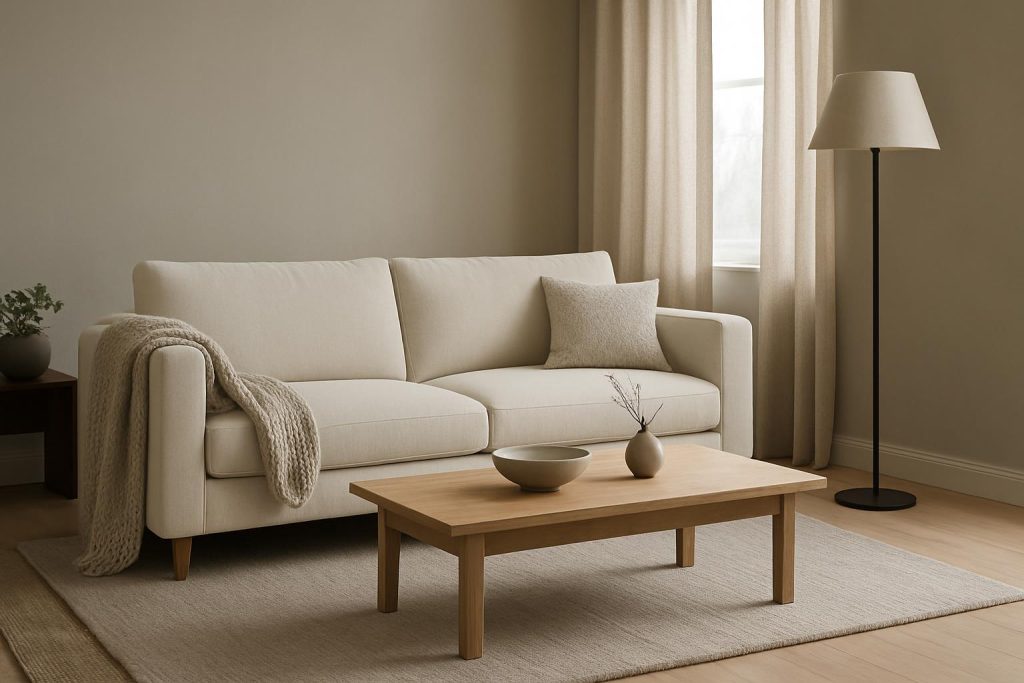
Choose simple shapes with soft edges. A bench seat sofa in a neutral performance fabric sets the tone. Add one or two accent chairs in a slightly deeper or lighter neutral for depth. Wood coffee tables and side tables in oak, walnut, or stained ash bring warmth.
Slipcovers add practicality. Linen, cotton twill, and performance blends resist stains and can be cleaned or replaced. Use tight skirts or simple legs for a tidy silhouette.
Scale and placement
Match furniture scale to room size. In small rooms, use a sofa with raised legs and a narrow arm to keep the sightline clear. In larger rooms, a deeper sofa and a larger coffee table help fill space. Keep pathways 90 cm or more for easy movement.
Lighting that flatters neutrals
Use three layers of light. Ambient light from ceiling fixtures or shaded lamps sets the base. Task light from reading lamps or swing arms supports function. Accent light from picture lights, sconces, or candles adds glow and shape.
Choose warm white bulbs around 2700–3000K for evening comfort. Dimmers help control brightness. Linen or paper shades soften glare and add quiet texture. Place lamps at different heights to avoid flat light.
Pattern and subtle print
Neutrals can carry pattern when contrast is low. Use tone-on-tone stripes, herringbone, small checks, and block prints in related shades. Mix small, medium, and large pattern scales so they do not compete. Keep the color depth tight to maintain calm.
Accent color with restraint
Neutrals do not mean all beige. Add one or two muted accents drawn from nature. Soft sage, olive, muted blue, smoky plum, or terracotta sit well in neutral rooms. Repeat each accent at least three times across pillows, art, a throw, or a vase so it feels intentional.
Let art carry a controlled amount of color. Choose pieces with calm backgrounds and a restrained palette. Matte frames in wood or black help anchor the room.
Metal finishes that stay classic
Limit yourself to one primary metal and one supporting metal. Brushed brass pairs well with black or oil-rubbed bronze. Polished nickel pairs well with black or pewter. Use the primary metal on main fixtures and the supporting metal on small details. A touch of black is useful as visual punctuation.
Styling without clutter
Keep surfaces simple. On the coffee table, combine a low tray, a stack of books, a bowl, and a small plant or branch. Use fewer, larger pieces instead of many small objects. Leave negative space so the eye can rest.
Hide remotes in a box. Use woven baskets for throws and toys. Keep decor below eye level unless it is art or lighting. Step back and remove one item if the surface feels busy.
Window treatments that soften the room
Floor-length curtains in lined linen or cotton add fullness and warmth. Use a pinch pleat or simple heading for structure. Mount rods high and wide to make windows feel larger and to keep maximum light.
Roman shades or woven wood shades add privacy and texture. In bright rooms, layer a blackout-lined shade with sheer curtains to control glare without losing softness.
Built-in storage and tech
Closed storage keeps the neutral look clean. Low media cabinets with doors hide devices. Built-in shelves with a mix of doors and open sections balance display and storage. Use cord covers or in-wall cable management to keep sightlines tidy.
If the TV dominates, consider a frame-style display with art mode, a low-gloss wall finish to reduce reflections, and a darker media wall to help the screen recede.
Family friendly choices
Choose performance fabrics for sofas and chairs. Look for stain resistance and high double rub counts. Slipcovered seating is easy to wash or replace. For rugs, consider wool, wool-blend flatweaves, or indoor-outdoor materials in a heathered tone that hides minor marks.
Rounded corners on tables and ottomans improve safety. Use washable pillow covers with hidden zippers. Keep a small cleaning kit in the room so upkeep is quick and consistent.
Seasonal updates that do not break the palette
Swap pillow covers and throws by season. Use lightweight linen and cotton in spring and summer. Use wool, bouclé, and chunky knits in fall and winter. Bring in seasonal branches and greenery for life without adding visual noise.
Change a lampshade, a tray, or a small art print for a fresh mood. Keep the base steady so updates feel unified.
Budget and DIY wins
Paint is the highest impact change per dollar. A cohesive wall and trim color can transform a room. Try a simple limewash effect for movement on a modest budget.
Shop secondhand for solid wood tables and vintage lamps. Refinish wood in a matte topcoat to fit your palette. Use slipcovers to refresh a dated sofa. Replace hardware on cabinets and furniture with simple metal pulls to modernize a piece. Frame printable art or fabric remnants to fill a gallery wall at low cost.
Common mistakes and how to fix them
Monotony is the top issue. If the room feels flat, add texture through a nubby pillow, a wool rug, a slubbed linen curtain, or a stone object. If everything is smooth, introduce at least one tactile element per zone.
Clashing undertones cause unease. If beige looks pink next to your gray, replace one piece with a greige or mushroom tone that bridges warm and cool. Test fabrics and paints together under your room’s light.
Too cold is common in all-gray rooms. Add warm wood, brass, cream textiles, and warm bulbs to soften the effect. If the room is too warm and yellow, add black or charcoal accents, cooler grays, and natural stone to balance.
Scale issues break flow. If a big room feels empty, increase rug size, pick a larger coffee table, and add a second seating element. If a small room feels cramped, show more leg on furniture and use fewer, larger pieces.
Care and cleaning to keep it timeless
Vacuum rugs weekly and under furniture monthly. Rotate cushions and fluff inserts to keep shape. Blot spills fast with a clean cloth and mild soap, then rinse and blot dry. Avoid harsh chemicals that strip finishes and leave marks.
Protect fabrics from strong sun with lined curtains or UV-filter film. Wash slipcovers as directed and line-dry to prevent shrinkage. Dust wood and metal with a soft cloth and use coasters to avoid rings. A steady routine preserves the calm look and saves time later.
Bringing it all together
A timeless neutral living room is not blank. It is layered, tactile, and edited. Build a tight palette, choose the right base for your light, and mix textures with intention. Use warm bulbs, simple patterns, and one or two muted accents. Keep storage closed and styling minimal. Maintain with simple weekly habits. Follow these steps and your living room will feel calm today and stay relevant for years.
FAQ
What is a neutral color palette for a living room?
A neutral palette uses white, cream, beige, greige, taupe, soft gray, charcoal, and soft black. Keep to three to five related tones and aim for about 70 percent base color, 20 percent supporting neutrals, and 10 percent contrast or accents.
How do I add color to a neutral living room without losing the timeless look?
Limit color to one or two muted accents drawn from nature, such as sage, muted blue, or terracotta. Repeat each accent at least three times across pillows, art, throws, or accessories, and keep saturation low so the room stays calm.
How can I make a neutral living room feel cozy, not cold?
Layer texture with wool, bouclé, linen, jute, wood, and stone. Mix warm and cool neutrals for balance. Use warm white bulbs around 2700–3000K and add layered lighting. Add a large rug, lined curtains, and a few black or wood accents for depth.
What are budget-friendly ways to create a neutral living room?
Start with paint for the biggest impact. Shop secondhand for solid wood pieces and lamps. Use slipcovers, replace hardware, frame printable art, and try a simple limewash effect to add movement without high cost.
How do I maintain and clean a neutral living room?
Vacuum weekly, rotate and fluff cushions, and blot spills fast with mild soap and water. Protect fabrics from sun with lined curtains, wash slipcovers as directed, and dust wood and metal with a soft cloth to preserve finishes.