We are reader supported. When you purchase through links on our site, we may earn an affiliate commission. Also, as an Amazon affiliate, we earn from qualifying purchases.
Coastal neutral living rooms feel calm, bright, and easy to live with. The right colors make the space look larger and more relaxed, while still warm and welcoming. This guide breaks down simple color choices, smart undertones, and practical finishes you can test today. You will see how to avoid flat, cold looks and how to keep the scheme clean and low maintenance. Follow the steps and you will build a room that stays fresh through seasons and trends.
What Coastal Neutral Means
Coastal neutral is a palette built from soft whites, sandy beige, pale greige, and light gray. It uses gentle contrast, natural textures, and a few muted accents. It avoids bold saturation and heavy warmth. It looks best with daylight and layered materials like linen, jute, rattan, and light woods.
The result is easy on the eyes and simple to maintain. The room feels airy without looking empty. It supports many furniture styles, from classic slipcovered sofas to modern clean lines.
Build a Balanced Coastal Neutral Palette
Core wall colors
Start with a wall color that reflects light well. Look for soft whites with a hint of warmth, sandy beige, pale greige, or light silver gray. Aim for a light reflectance value in the medium to high range so the room stays bright. Examples you can test include warm white around hex F6F2EA, sandy beige around hex E8DCCF, pale greige around hex DCD4C9, and light gray around hex E8ECEF.
If your room faces north and reads cool, favor warm white or beige. If your room faces south and looks warm, a pale greige or soft gray can balance it.
Trim and ceiling
Trim should look crisp against walls but not stark. Use a clean soft white. If walls are warm, keep trim slightly cooler but still soft. If walls are cool, a warmer soft white adds balance. Ceilings can be the same as trim or 10 percent lighter than the wall shade to lift the height visually.
Wood tones and stains
Light to mid wood tones fit the coastal neutral story. White oak, bleached pine, and driftwood gray-beige stains work well. Avoid heavy orange or red undertones. If you already own darker wood, add lighter textiles and a pale rug to soften contrast.
Textiles and textures
Layer linen, cotton, boucle, and soft knits. Add a jute or sisal base rug for texture and a low pile wool or cotton rug on top for comfort. Keep fabrics in soft oatmeal, stone, fog, and ivory. Add subtle stripes or small-scale checks for movement without noise.
Accent colors to keep it neutral
Use accents as low-saturation support, not a headline. Try pale sky blue around hex CFE6F3, soft sea glass green around hex DCEFE6, muted clay around hex DDB7A0, or charcoal around hex 44484F for depth. Keep accents under 10 to 15 percent of the room so the base neutrals stay in charge.
Sample Coastal Neutral Color Combinations
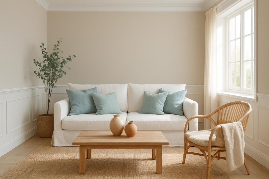
Warm sand and seagrass
Walls warm white hex F5F1E8. Trim soft white hex FAFAF7. Sofa oatmeal. Rug jute with a thin cotton topper. Pillows in pale blue hex CFE6F3 and stone. Wood in white oak. Black metal at small scale for contrast like a lamp base or picture frames.
Misty gray and driftwood
Walls light silver gray hex E9EEF2. Trim white hex FFFFFF. Floors in driftwood stain. Textiles in fog, pebble, and charcoal stripe. Accents in sea glass green hex DCEFE6. Plants in matte ceramic. The look is calm and crisp without feeling cold.
Greige coastal classic
Walls pale greige hex E5DED3. Trim creamy white hex F9F7F2. Sofa in flax. Pillows in navy gray hex 7C8B99 and clay hex D8B4A6. Rug wool in ivory heather. Add woven baskets and a rattan side chair to finish the texture mix.
Sunny beige and crisp white
Walls sandy beige hex EADFCF. Trim bright white hex FFFFFF. Touches of matte black hex 2B2B2B at curtain rods and a side table base. Sage accents hex DDE7DF on pillows and a throw. Light oak coffee table holds the palette together.
Understand Undertones and Light
North vs south light
North light is cool and can make pure gray look flat. Choose warm white, beige, or warm greige in north rooms. South light is warm and may turn beige yellow. Balance with greige or soft gray with a slight blue or green undertone.
Test swatches correctly
Paint large swatches at least 60 by 60 centimeters on different walls. Use two coats. Check morning, midday, and night under lamps. Compare against white paper to read undertones fast. Live with samples for two days before deciding.
Pick the right sheen
Walls do well in matte or eggshell. Matte hides flaws best and reads soft. Eggshell adds a little scrub-ability for family rooms. Trim works in satin or semi-gloss. Ceilings look best in flat to avoid glare.
Furniture and Layout Choices
Sofas and chairs
Choose light to medium neutrals in performance fabrics. Flax, oatmeal, and stone are forgiving. Slipcovers help with cleaning and updates. Keep sofas simple and low profile to maintain an open feel. Add one accent chair in a woven frame or light wood to break up fabric mass.
Rugs and layering
Size first. The front legs of sofas and chairs should sit on the rug. In most living rooms, 8 by 10 or 9 by 12 works. A jute base gives texture and a soft wool top rug adds comfort and pattern. Stay in cream, sand, and fog tones with small-scale stripes if you want pattern.
Storage and clutter control
Use closed media units to hide cables. Choose a storage ottoman for blankets. Add two to three woven baskets for toys and magazines. Keep surfaces clear. Rotate decor by season, not more than five items on a coffee table and console combined. Coastal neutral reads best when visual noise is low.
Finishing Touches
Metals and hardware
Brushed nickel and soft brass add warmth. Matte black adds structure in small doses. Limit to two metal finishes in one room to keep it cohesive. Use the same metal on two to three items so it looks intentional.
Art and decor
Use simple seascapes, black and white photos, or abstract texture art. Frames in white, light wood, or thin black. Add ceramic vases in sand and clay. Woven trays corral remotes. One or two sculptural objects are enough. Avoid themed decor overload.
Window treatments
Linen or cotton panels in white, oat, or soft gray are ideal. Hang high and wide to lift the room. Simple natural shades or white wood blinds work under panels. Skip heavy patterns to keep the palette calm.
Greenery
Olive trees, eucalyptus, or snake plants add life without loud color. Use stoneware or woven planters. Place one tall plant and one small tabletop plant to balance the room.
Small Spaces and Rentals
Keep walls light and consistent across connected spaces. Use mirrors to bounce light. Pick glass or open base coffee tables to show more of the rug and floor. Choose furniture with legs showing to reduce visual mass. For rentals, focus on textiles, rugs, art, and lamps. Add peel and stick wall decals or a removable mural in soft sand tones if you want an accent without paint. Use large area rugs to cover floors and tie mixed furniture together.
Budget Friendly Steps
Paint walls first for the biggest impact. Next, replace or add a larger rug. Add slipcovers to refresh a sofa. Swap pillow covers and throws for new color direction. Thrift light wood side tables and refinish them with a light stain. Spray paint frames and small metal pieces to unify finishes. Update lampshades to linen.
Cleaning and Maintenance
Walls
Dust walls quarterly with a dry microfiber mop. Spot clean scuffs with a damp microfiber and a drop of mild dish soap. For stubborn marks, use a melamine sponge lightly and test in a corner first, especially on flat paint.
Upholstery and rugs
Choose washable slipcovers when possible. Vacuum upholstery weekly with a soft brush. Blot spills fast with a clean cloth. Use a mild fabric cleaner on small stains. Avoid over-wetting. Rotate rugs every six months. Vacuum jute often but keep water away. For wool or cotton rugs, treat stains with cold water and a tiny amount of gentle soap, then blot dry.
Wood care
Use coasters. Add felt pads under decor and lamps. Dust weekly with a dry cloth. Clean with a slightly damp microfiber, then dry. Avoid heavy silicone polishes. Re-oil or wax light woods only if the finish requires it.
Common Mistakes and Fixes
Too much gray can feel cold. Fix with warmer textiles and a warmer white or greige wall shade. Too much bright white can glare. Fix with matte sheen and textured layers like a jute rug and linen curtains. A tiny rug makes the room feel small. Fix with an 8 by 10 or 9 by 12 that hits under front legs. Overusing blue accents shifts the room from neutral. Fix by reducing blue to pillows and one vase, then add clay or charcoal to rebalance. High contrast black on too many pieces can feel harsh. Fix by limiting black to two or three items.
Step by Step Plan to Execute
Audit the room. Note light direction, existing wood tones, and what must stay. Choose your base palette with one wall color, one trim white, and one to two accent colors. Test swatches large on two walls and view them all day. Decide on sheen before buying paint. Paint ceilings, then trim, then walls. Place the largest rug next. Bring in the sofa and main chairs. Add the coffee table and side tables. Layer textiles with pillows and throws. Select two metals and repeat them. Install window panels high and wide. Adjust bulbs to 2700 to 3000 Kelvin for soft light. Add art and two to three decor pieces. Step back and remove one item if it feels busy. Live with the space for a week and fine tune.
Conclusion
A coastal neutral living room relies on soft light colors, gentle contrast, and honest textures. Start with a balanced wall and trim combo, keep wood tones light, and add only a few muted accents. Test undertones with real swatches and choose the right sheen. Use simple furniture shapes and right-sized rugs. Control clutter and maintain easy cleaning habits. Follow the step by step plan and you will get a calm, high impact room that stays timeless and practical.
FAQ
Q What are the best wall colors for a coastal neutral living room
A Soft whites with a hint of warmth, sandy beige, pale greige, and light silver gray work well. Keep LRV medium to high so the room stays bright.
Q How do I keep a coastal neutral palette from looking flat
A Layer textures like linen, jute, and boucle, add light to mid wood tones, and include a small amount of muted accents such as pale blue, sea glass green, clay, or charcoal.
Q Which accent colors work without losing the neutral feel
A Pale sky blue, soft sea glass green, muted clay, and charcoal add interest while keeping the palette calm when used in small doses.
Q How do I test paint colors the right way
A Paint large two-coat swatches on different walls, view them in morning, midday, and evening light, and compare against white paper to read undertones.
Q How do I maintain light upholstery and rugs in a coastal neutral room
A Use performance fabrics or slipcovers, vacuum weekly, blot spills fast, treat stains gently, rotate rugs twice a year, and keep jute dry.